This guide is for Vigitron brand marketers, designers, developers, and even external collaborators. Here, you'll find the principles
and tools you need to communicate our story the authentic Vigitron way.
While this guide includes a number of brand guidelines, we hope that as you explore it, you'll develop an intuitive understanding of
how our brand expresses itself, both visually and verbally.
If you need resources beyond the tools and templates provided, please contact us at: marketing@vigitron.com
Tagline:
Innovative Networking Solutions
Mission Statement:
To provide high-performance, reliable network connectivity solutions that empower security and communications systems worldwide.
Brand Voice-Tone:
Confident, Technical, Reliable
Target Audience:
System integrators, security installers, distributors, and B2B buyers in the physical security and industrial networking sectors.
Brand Values:
At Vigitron, reliability is a core design principle. Our products are developed to maintain consistent power and data delivery in demanding environments including long-distance, industrial, and security-based applications. We support this with practical, solution-focused technical support, offering documentation, application guidance, and access to knowledgeable engineers.
Our approach to innovation centers on real-world functionality. We focus on extending PoE range, maintaining data integrity, and simplifying system integration without adding unnecessary complexity. With a commitment to clarity, we design our tools, materials, and documentation to help customers identify the right solution efficiently and deploy it with confidence.
Our logo is the visual representation of our purpose. Vigitron's official logo features the colors red, white, and black. It should be used consistently across all marketing materials and brand communications.
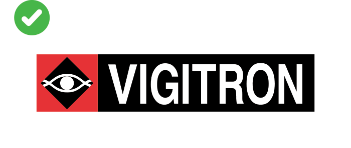
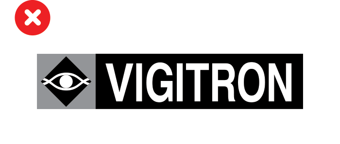
Always use Vigitron's logo in its full-color version. Do not use black-and-white, grayscale, or any other modified versions of the logo.
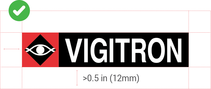
Maintain adequate clear space around the Vigitron logo to ensure maximum visibility and avoid visual clutter. As a general rule, leave at least 0.5 inch (12mm) of clear space on all sides of the logo.
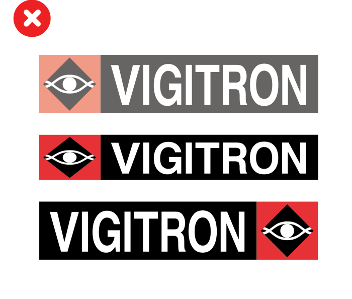
Do not adjust Vigitron's logo in any way. Avoid changing colors, applying tints, stretching, wrapping, or resizing the logo disproportionately.
This is our primary color palette.
Hex and RGB are for screens. CMYK for print.
Primary Font Family: Roboto
Header Style: Roboto Black
Body Text Style: Arial Regular
Product Photo Guidelines
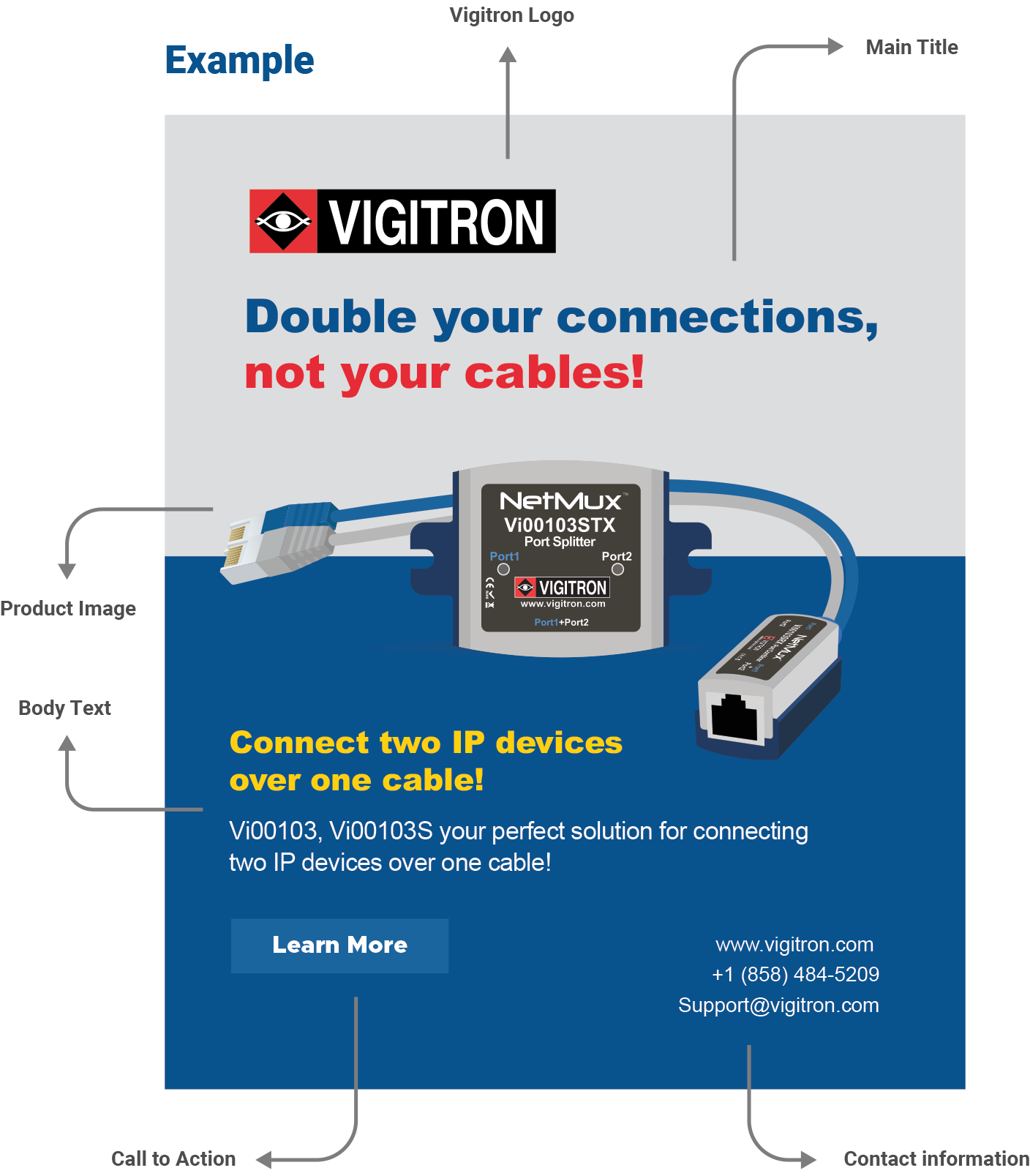
Use high-resolution, clear product images with a transparent background. Each Vigitron product from multiple standard angles: front, back, left, right. Maintain consistent lighting, perspective, and scale across all product photos. Refer to the examples below as the standard for all product photography.
Tone & Personality:
Clear, professional, technically confident - written for industry professionals who value precision and reliability over marketing fluff.
Voice Characteristics:
Key Messaging Pillars:
Engineered for Security Applications - Purpose built for IP video, access control and industrial network environments
Power and Distance Without Compromise - Delivers extended PoE and data beyond standard Ethernet limits
Installer-Focused Design - Built for efficient deployment with rugged housings, intuitive labeling, and mounting flexibility.
Reliable Support and Documentation - Backed by detailed datasheets, illustrated diagrams, and knowledgeable technical assistance.
Visual Guidelines:
Use clean, professional graphics that align with Vigitron’s technical identity. Visuals should follow brand colors and maintain consistency in layout and tone. Vigitron logo is used appropriately and never altered.
Content Focus:
Highlight how Vigitron products solve common challenges in power, distance and system integration.
Use carousels, diagrams, and short videos to clearly communicate product function, advantages or use cases.